

Marequit
A contemporary urban market where the energy of a farmers market and the craft of a restaurant come together.
The concept is built around being two things at once: a place to taste and a place to take home. Local farmers and growers as the foundation, the season as the menu. You eat at the bar, bring something home, or both. Marequet moves with the moment.
The visual identity is as confident as the concept. Strong blue, bold graphic typography, geometric shapes that feel like both a market stall and a brand. The letters of the name become a flexible system — working across packaging, signage and facades. No soft tones or rustic warmth. Marequet knows where it stands.
The result is a brand identity that combines local and urban without smoothing out the tension between them.
Brand identity · Concept development · Visual identity
Manify x Ford
The challenge: the Capri couldn’t physically enter the whole venue. Yet the brief was to make it the centrepiece of the evening. Exactly the kind of constraint a strong concept is built on.
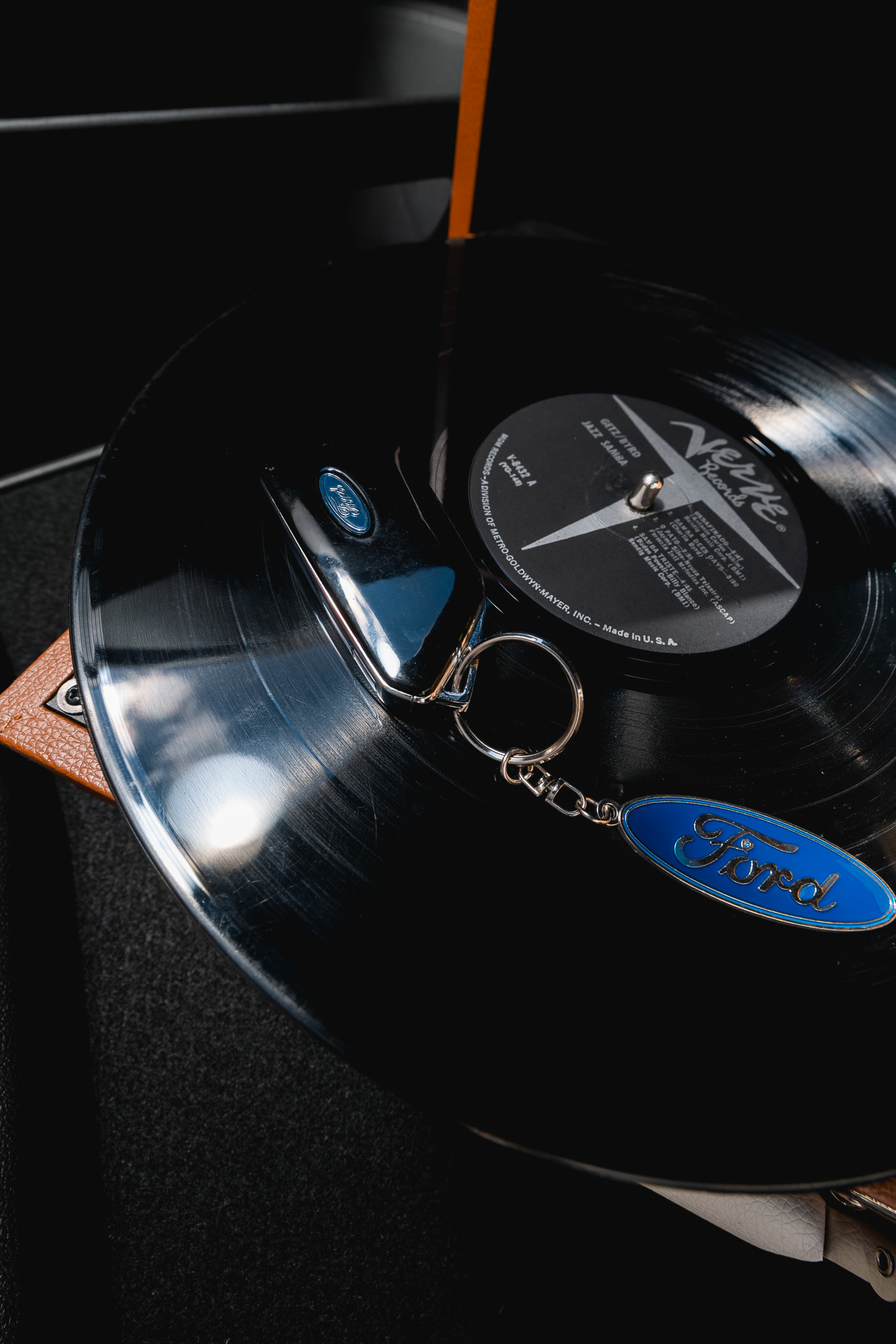
The night begins outside. The Capri is there. Trunk open, record player spinning, burgers served on the hood, “FORD” written in mustard. Not a staged setup, just a night that happens to be branding. Then everyone moves inside with the key.
Once inside, a vintage Ford keychain becomes the thread running through the night. Passed from hand to hand, appearing on the arcade machine, resting beside a cocktail at the bar. The car remains outside, motionless, waiting. Yet its presence is everywhere
The visual language: raw, analog, and unpolished. Flash photography, warm tones, and an edit that embraces imperfection. All brought together in a fully developed creative concept.
Not a car you simply show. One that’s part of good memories.

MOK
An eclectic city coffee bar with a distinct visual identity.
Most coffee bars look the same. Warm brown tones, chalk handwriting, a wooden shelf with plants. MOK doesn’t. The starting point was a place with an opinion and an identity that reflects it.
Yellow and purple as a colour palette. Not the safe choice, but the right one. Combined with a graphic, distinctive logo that works on a coffee cup, a window, and a wall equally. The moodboard, logo variations, and interior visuals all stem from the same core: a place you recognise before you’ve even had a sip.
Everything is developed as one coherent system. From brand identity to interior direction. Not a coffee spot with a logo. A concept that knows who it is.